

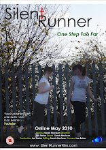
When sketching our three ideas we kept in mind to portray the essence of the film, genre, appeal to the audience and possibly give a hint to the storyline. These were rough sketches and therefore not to scale and detail but gave us freedom to express the general idea and expand the idea creatively in detail when we apply it to production stage on the computer using the appropriate software.
As well as sketching possible image and layout design ideas we also also had to design possible font ideas, whilst researching other title fonts other horror film posters have used such as:

We decided that a straight, neat, possibly upper class font was required and that we could create an effect using colour rather than a suggestive font.
No comments:
Post a Comment