26/01/2010

Editing Magazine Review Product

Editing the magazine review product involved firstly placing the chosen snap shoot image into place and editing this image appropriately to fit the size of the established area and also darkening the image for a more spooky effect to further portray its genre.

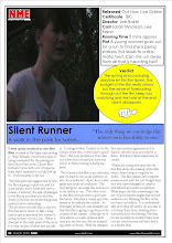
We also had the idea of adding some colour to our magazine review although this does contradict our genre but does follow the convention set by the magazine NME which traditionally uses allot of colour in its articles. We followed this convention by making some of our text boxes colourful using colour that NME are associated with which is usually blue and yellow.

Our editing process also involved the creation of our ranking system as we felt that we wanted to challenge the convention of a traditional ranking system of stars which involved in research to alternatives which we had the creative idea of a simple thumb's up or down which as we ranked our film average we had to find a sideways thumb. Also as we stated that this review is published in the music magazine NME we had to establish that by presenting the NME logo on our review which is conventionally placed on the top left corner of our page layout.

Drafting Film Review Layout

Drafting the layout of the magazine review page involved researching other magazine review pages and trying to imitate those and use them as a baseline for inspiration of producing our draft of our page layout for the magazine review page. Using the convention of having a snapshot of a point of the film in the film review, we decided to place the image as it was a portrait image in a corner preferably in the the top left as most Magazine review pages do. We also planed to follow the convention of having a number of the film details somewhere on the page plus title and tagline. At this point we wasn't sure of having a pull quote or star rating due to space constrictions.


To have an idea of space we firstly created a number of text boxes stating what each box area will consist of to gain insight of page layout space. We done this on Microsoft Publisher to have a plan of what area we have to work with and basically to experiment with a number of ideas on how to make our layout original and appealing.

Choosing Most Appropriate Image From Film

Choosing the most appropriate images from the film was not a difficult as I found from my research the image usually taken is from the part of the film with the most excitement and adrenaline. When selecting the right image from the film I had to select the right scene in which to view from to take a snap shot at the right moment, the scene I selected which I believed was the most effective was the dark chase scenes as I believed it expressed the essence of the film, quality of acting, mise en scene and genre of the film at its best quality.

To select this image I had to view the scene and take a snapshot of the scene using the Adobe Premiere software to pause the film as save the onscreen image as a picture to be later edited and displayed in our magazine review page.

Drafting Film Review Text

When drafting the text of the film review we purposely set out to make the review a negative review so that it would appear more realistic as a review as most film reviews are negative especially in the short film category. This would also make t easier to point our positive aspects of the film and make it more appealing and exciting to read. It did seem a bit of a cliche to denigrate our film but it gave us the freedom to evaluate our film in an external point of view and allowed us to creativity write about our film from a different angle.

We also decided to follow the convention of writing details/statistics about our film which involved research into our own film including length. We also wrote details about production crew,age rating, we also followed the convention of writing about the release date and gave a brief plot description.

We finally drafted idea's for pull quotes and other humorous quote we could use throughout the page layout plus the future release date of the article and the website address of our film and the website address of the NME magazine.

Analysing Design & Language Conventions of Magazine Reviews

When researching other magazine reviews I found numbers of convention that appeared in many reviews including conventions of review layout and language. There are a number of layout conventions of magazine reviews, one layout convention that I found that appeared in many film reviews was a snapshot image of a certain moment in the film usually the most exciting scene. Another layout convention that is common is a pull quote that is sometimes enlarged to stand out. Obviously in all film reviews you have the title of the fum and other details of the film including time and actors names. Layout conventions also included how the review itself is represented which is often laid out in columns sometimes involving a bullet point list and of course the classic star rating system.

There are also a number of language convention of magazine reviews as well. One language convention i found to be common was that most film reviews were written informally as to appear more casual to appeal to young audiences as appear less intimidating to readers, this was also done by making most film reviews short and to the point. Another common feature of language in film reviews was the use of rhetorical questions, puns/jokes and references.

Researching Different Film Magazine Audiences

When researching other film magazine audience I found that depending on the content of the magazine such as the from the type of film they review to the detail they include when analysing the film. I found that magazines that cover mostly action film mostly consist of a male audience and fashion magazines that sometimes cover film reviews are mostly of a female audience such as:

This type of audience difference can also be seen in the age of the audience of those mags that review more adult films with a higher age rating are likely to have an older audience but those magazines that are design at teenagers or younger children are likely to contain reviews of lower age rating films such as those of animation etc such as:

We decided that we had to select a magazine that would attract an audience similar to our target audience which I've define previously as unisex 14 - 25 year old's, particularly students which from research we be believe the magazine that best suited our target audience and film genre was the magazine New Musical Express (NME):

We decided on this magazine as its best suited our audience and film as an audience that enjoys the type of contents of this particular magazine, the music covered in this magazine and the other film that have been advertised in this magazine would also be attracted to our film, plus the target audience is roughly similar.

Drafting/Editing Film Posters

Drafting and editing our poster layouts involved using the software Microsoft Publisher and Fireworks manipulate our chosen image and allow us to use our creativity to create visual effects on our chosen poster image.

We chose that producing two images of the actress onto one background would be a good visual effect and give the hidden message of abnormality or anxiety of the actress. This was doable with the software we had which involved cropping an image of the actress out of the chosen image we thought looked the most natural running position onto another image we took of our actress running.

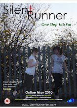
Once the actress's body image was cropped out of the background and pace on the other image we altered the brightness of the image to make it stand out from the other to look unnatural and give the misconception of a spirit to the audience. then when the image was completed we started constructing the layout design into place with the Title and Tagline in place. Institution Logo and age rating in place and the bottom corners, then finally entering the release date, review comments,website address and production team details.

Once we created the final three posters we had to select the poster we felt was most effective to be our final film poster. Here are the other two drafts that wasn't selected:

Choosing Most Appropriate Poster Images

When choosing the most appropriate images we wanted to select the most natural looking image that we could easily manipulate to apply a special effect. We also took in the factor that we wanted three separate ideas which we applied three separate backgrounds and actress positions to allow us to experiment with ideas and give us choice in selecting the most effective design out of the three.

Besides from choosing the most appropriate background to use and best actress position we also had to choose the most appropriate image to apply editing software to. We planed to use the software Fireworks to crop out the image of the actress to place on the plain background image to give the visual effect of empathises other special effect applied to the image were to be decided at a later date.

Setting Up Mise en scene of Poster

When we started organising our photo shoot we decided to take a number of images at separate setting's to produce a different background to experiment with ideas. As our film was a modern approach to the classic horror film we kept the classic convention setting of a forest which was on of our setting's with the other two setting being present in the film. We also took an image of the plain background setting without the actress in place to later be used for possible visual effects.

We also directed our actress to produce a number of poses and running setting's to analyse the best figure position that is effective and looks natural as w e could take an image of our actress whilst in motion due to issues of focusing.

When researching other horror film poster and their use of mise en scene we found that a use of a prop or special effects were often used to produce a suggestive message. however we could not exactly reciprocate this as our film did not involve a definitive prop such as a murder weapon however we could at a later date add an image effect which we kept in mind during the photo shoot process.

We kept the other areas of mise en scene such as lighting and costume simple such as using natural light and on stage costume.

Sketching Possible Poster Images and Fonts

When we started the discussion and sketching procedure of creating a possible poster image and poster layout we initiated a trial and error procedure. we aimed to produce three different poster designs with separate images to select the most effect of the three at a later date. Here's an example of one of our rough sketches:


When sketching our three ideas we kept in mind to portray the essence of the film, genre, appeal to the audience and possibly give a hint to the storyline. These were rough sketches and therefore not to scale and detail but gave us freedom to express the general idea and expand the idea creatively in detail when we apply it to production stage on the computer using the appropriate software.

As well as sketching possible image and layout design ideas we also also had to design possible font ideas, whilst researching other title fonts other horror film posters have used such as:


We decided that a straight, neat, possibly upper class font was required and that we could create an effect using colour rather than a suggestive font.

Pitching Ideas for Poster

When pitching ideas of a film poster design during a discussion group we initially done a rough sketch each of our basic idea of our poster design. We then discuss a number of creative ideas to portray to the viewing audience a sense of the genre and storyline.

As well as pitching ideas for the visual aspects of the poster such as the image we also had to pitch ideas for the tag line, institution logo, review statements and at this stage we still did not have a fixed title.

When pitching ideas for the said things above we came up with a list of spontaneous ideas for a title which we then creatively suggested that the one we liked the most would be our working title and the second would be our tag line if its fits and is suitable. We also decided to go through the same process of discussion and sketching to produce a idea for a institution logo.

Analysing Film Poster Conventions

When analysing film poster conventions we done research into otter film posters of films in the same genre category as our film so we can gain some insight into common aspects and gain inspiration for producing our own film poster in a similar style. Whilst researching other horror film posters such as:

From other film poster research we found that a number of conventions appeared in horror film posters. a common convention of a film poster is that the masterhead/title is generally at the top of the poster with the tagline directly underneath. Another convention of a film poster is that the release date and production team details are at the centre bottom of film poster with the age rating and institution logo at both bottom corners. Also most film posters include film review statements.

Film Shooting Schedual

When organising the original shooting schedule we had to take into the factor of our availability due to our external responsibilities. As at this point we still had three group members this was difficult to organise but we settled to mostly film on free lesson times on a Thursday afternoon and on weekends. We did draft a basic shooting schedule as we establish that it would be unnecessary due to known improbability of having a consistent shooting schedule.

Our shooting schedule was designed to keep track of our filming process in which this caused minor problems to our progress which resulted in the change of the dynamics of the group. Firstly we decided to replace our original actress Natalie with our group member Sarah which aloud us more time to organise for filming. We also during the same week lost a member of our group due to her lack of participation in the work and subject which lead to her dismissal from the subject by our subject teacher.

We didn't exactly have an established shooting schedule but did agree to mostly film on the same day of Thursday and whenever we were free on the weekends, however due to the content of our film and difficulties in weather and lighting that effect the story and order as we had to think about the continuity of our film which resulted in a few cancellations.

Film Organisation of Locations, Actors etc

In preparation of filming our product during organisation we established what locations we will be filming in for each scene. Our short film in set in five locations, house, small roads, main road, park entrance and finally secluded forest. our location were filmed mostly in the day except the secluded forest location which needed darkness for drama.

Once we were settled and established what setting we will be filming in we had to arrange what actors we would be using and what characters they would be playing. At first we thought it be best if we outsourced actors (Outside our group) so we can focus on factors behind the characters. However due to conflicting agendas and lack of availability plus the unsuccessful recruitment of replacement actors we had to act the roles ourselves. luckily our storyline and storyboard didn't involve both of us being in the same shot at once so mostly one of us could be behind the camera.

We then using our storyline and storyboard as a guide we had to produce scene plans for each scene so that we were organised and focus on what we wanted to do when it came to filming. Once we had finished our advanced production planning we had to organise permission to use to music track Massive Attack - Teardrop which we wanted to add to our film at a later date, which involved writing a letter of notification to the copyright holder.

Film Storyboarding

Once we produced our script we started sketching our storyboards based on each separate shot in each scene making sure that we include a variety of shot lengths, angles and include different technical aspects as in an Dutch tilt and eye line match etc.

We produced storyboards for each scene for a guideline to follow during production as it gives us a visual reminder of what is shown we stated on the sheet the type of shot and type of edit that followed and any dialogue, sound or camera movement to be produced plus an estimated time of shot.