
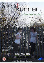
We chose that producing two images of the actress onto one background would be a good visual effect and give the hidden message of abnormality or anxiety of the actress. This was doable with the software we had which involved cropping an image of the actress out of the chosen image we thought looked the most natural running position onto another image we took of our actress running.
 Once the actress's body image was cropped out of the background and pace on the other image we altered the brightness of the image to make it stand out from the other to look unnatural and give the misconception of a spirit to the audience. then when the image was completed we started constructing the layout design into place with the Title and Tagline in place. Institution Logo and age rating in place and the bottom corners, then finally entering the release date, review comments,website address and production team details.
 Once we created the final three posters we had to select the poster we felt was most effective to be our final film poster. Here are the other two drafts that wasn't selected:

No comments:
Post a Comment