

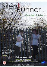
Whe researching possible fonts for our title we found that adding effects to the font didnt work well as we experimented with a number of styles and decided that we should adopt and more simple approach.

When deciding our design of our title we agreed that we would have a strait neat title and do something effective with the colouring. We picked the font style Century Gothic as we believe it would be effective in our poster, plus the name of the font stood out due to the genre of our film our tagline was of the same font and Italic. After writing the title in this font we noticed that unintentionally that the t in the word silent i our title looked like a crucifix and thought that we could something effective with that and colour that letter red to give the hidden message of danger.

We also believe it would be effective to separate the two words of the title separated with the second word beginning underneath conjoined with the crucifix to illustrate a embedded symbolism.
No comments:
Post a Comment